4 Keys to Great Human-Machine Interfaces
Bastian Solutions | 12 August 2011
A Human-Machine Interface (HMI) is a user interface through which humans and machines interact; the interface provides an operator with a graphic representation of the machine or operating system and then allows the operator to monitor and control that piece of equipment or system.
The design of computer-to-human interfaces is a well-covered topic. Generally, it is referred to as User Interface Design or UI Design, and there are many books, standards, guidelines, and even courses on the subject. In the world of industrial and material handling control systems, we focus on the software user interface between the operators and maintenance personnel of a machine or system to the computer or programmable logic/automation controller (PLC/PAC).
There are numerous design principles and guidelines involved with designing an HMI, so I've narrowed the list to what I think are the most important aspects to great industrial user interfaces based on my experience in machine and system controls.
4 Keys to Great HMIs
1. Know Your User
For most industrial human-machine interfaces, the user is either the machine or system operator or maintenance personnel. Focus on what these users will want to know and control and how they would like to interact with the system. Having a separate interface or screens for each type of user might be important in a complex system. Don't try to stuff all the information for each user into a single interface or group of screens.
2. Simplicity
The interface should be simple, even intuitive. The less training required to use the interface the more it will be used and appreciated. Keep the clutter down. Use more screens with less information on each and provide clear navigation controls between the screens.
3. Visibility
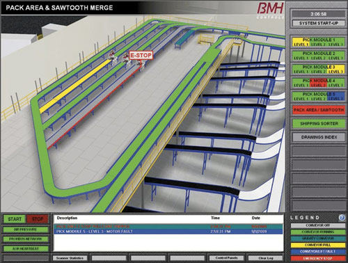
There should be visibility into all areas without overwhelming the user with extraneous or unneeded information. Use a color-coded navigation bar to give an overview of the system-wide status. Use animation to draw attention to faults and other issues. Provide intuitive navigational links to allow quick access to faults and recovery procedures.
4. Consistency
If your HMI contains multiple interfaces or screens, their information displays, layout, and actions should be consistent with the other screens. Don't put navigational buttons at the bottom of one screen and at the top of another, and use standardized color codes throughout the interface.
Designing great user interfaces is a challenge. It requires a lot of work to make the interface applicable, easy to use, appealing, and of course useful. A poorly designed interface can be confusing and a challenge to operate because it will not be intuitive for the users. Although there is always room for improvement, I believe you'll design a great interface if you simply focus on these four keys.
Other than what I mentioned above, what key aspect do you think is important when creating a great HMI?
Bastian Solutions, a Toyota Advanced Logistics company.
We are a trusted supply chain integration partner committed to providing our clients a competitive advantage by designing and delivering world-class distribution and production solutions.
Our people are the foundation of this commitment. Our collaborative culture promotes integrity, inclusion, and innovation providing opportunities to learn, grow, and make an impact. Since 1952, Bastian Solutions has grown from a small Midwest company into a global corporation with over 20 U.S. offices as well as international offices in Brazil, Canada, India, and Mexico.
Comments
Material Handling says:
8/28/2018 10:08 AM
It is a great step to clarify the visualization of interaction between machine and human for the better understanding of Human-Machine Interfaces. It is very necessary for the user to understand everything about the machines on which he will be working.
Leave a Reply
Your email address will not be published.
Comment
Thank you for your comment.